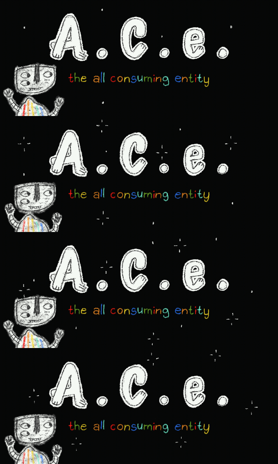
The All Consuming Entity
A downloadable game
Optional control: you can also press k to dash
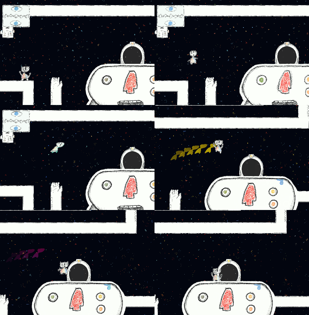
Jump-dashing with no directional input makes you unaffected by gravity - try it on tight gaps!
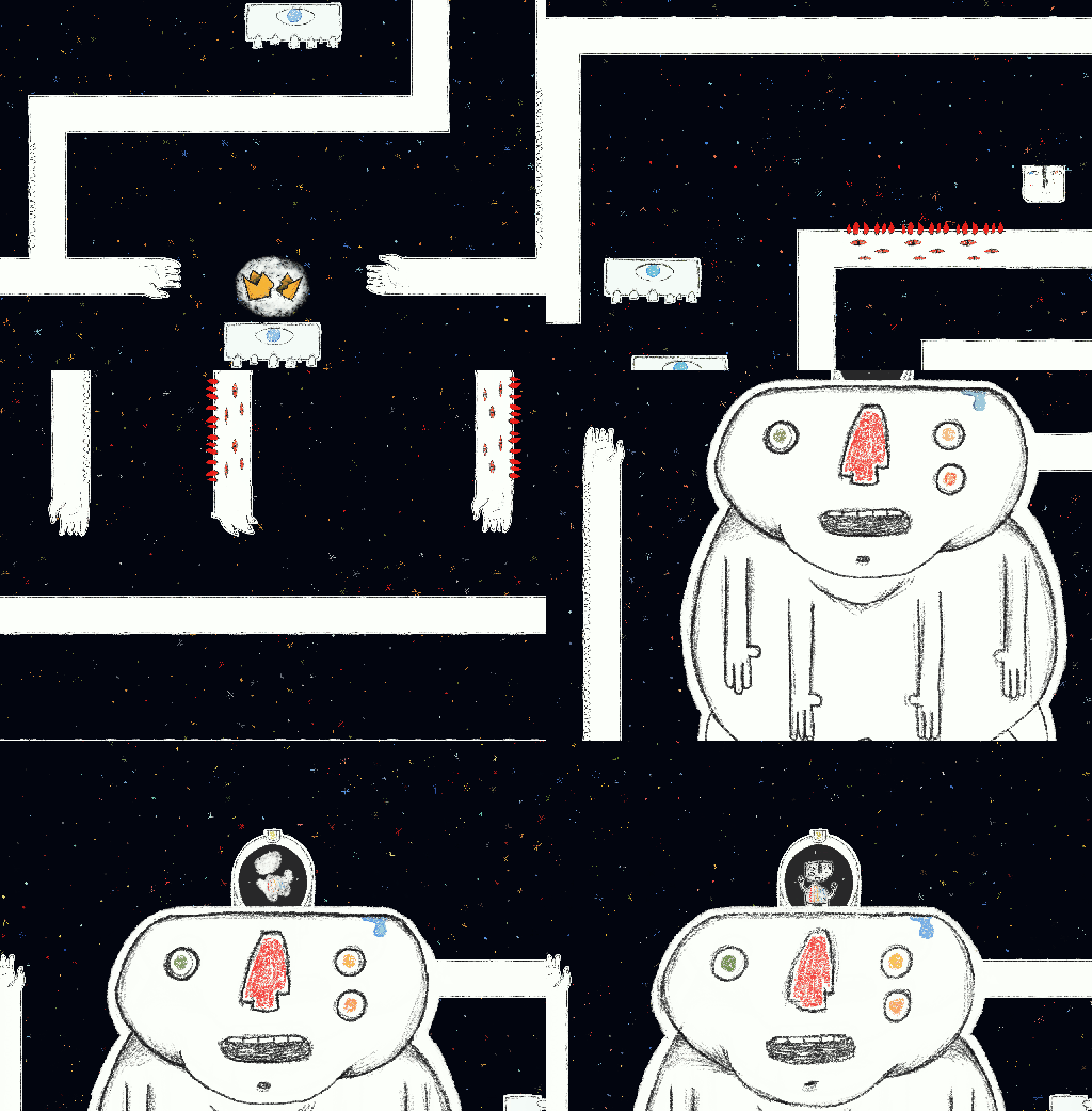
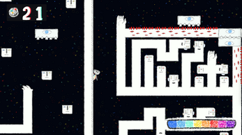
An ominous void is consuming the universe and only a plucky hand-drawn robot has the platforming prowess to collect the artifacts needed to lock it away!
-----------------------------------
One full level to prototype - created in 2 weeks by 4 strangers for Pirate Jam 14!
Web-playable version here https://highcontrast.itch.io/ace-web-playable (is a little janky)
aaaand here's the soundtrack: https://soundcloud.com/mecha-weeg/sets/a-c-e-ost
| Status | Prototype |
| Authors | HighContrast, Weeg, Adam Argam, Matthias Trinley, Trokaneon |
| Genre | Platformer |
| Made with | Godot |
| Tags | Cute, Difficult, Hand-drawn, Horror, Singleplayer, tense |
| Average session | A few minutes |
| Inputs | Keyboard, Xbox controller, Playstation controller |
Development log
- Procedural Level Generator! + Bug FixesFeb 04, 2024
- Spawn Multiple PCsJan 28, 2024

Comments
Log in with itch.io to leave a comment.
Hey I'm leaving a comment regarding feedback for the art in the game. I had some thoughts on some design stuff, but I'll focus on the art instead.
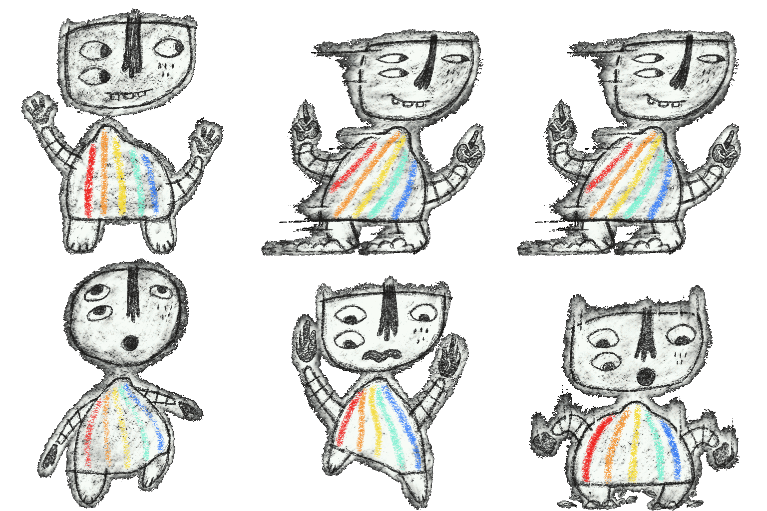
The art is really inspired and fun looking. The main character is iconic and well designed and animated. I think it would be nice to see a full walk cycle on him but the zoomie slide thing is pretty rad too. The animating game elements in the scenery are wonderful, especially the colorful star background. So good.
The level design tiles are really inpsired, and mostly sell it really well. They could only be improved really with a bit more variet of tiles. They are also a bit simple so in a larger game you'd maybe want to see some higher detailed floor tiles, perhaps.
Because some sprites are scaled up, it does perhaps reduce the cohesion of the art a bit. Perhaps the larger objects should have been drawn/scanned at a larger fidelity.
The player's colorful dash is really lovely. The tutorial is mostly well, though it did confuse me a bit as to what the ideal control setup for me would be, and it knowing K could be used to dash would have been nice to spell out a bit more.
The way you use red color to indicate danger is pretty effective.
Some of the scans have really clean cuts around the pencil line art which can make it feel a bit too obvious like a video game sprite instead of maybe the intended effect, that it's a pencil drawn reality in front of you, if that makes sense. For e.g. the player character gif on this page has a sort of artistic fade around the edge.
You are really good at this, and I wouldn't shy away from experimenting with digital art, I'm a fan!
I did end up quitting the game after being a bit too frustrated on some tough spots.
Great job everyone!
Thank you again for the kind words 🙏